Here’s a quick case study of updating an outdated design for the University of Texas Elementary School by leveraging the university’s visual identity. The new identity adheres to the university’s brand guidelines while giving it a unique feel appropriate for their audience.
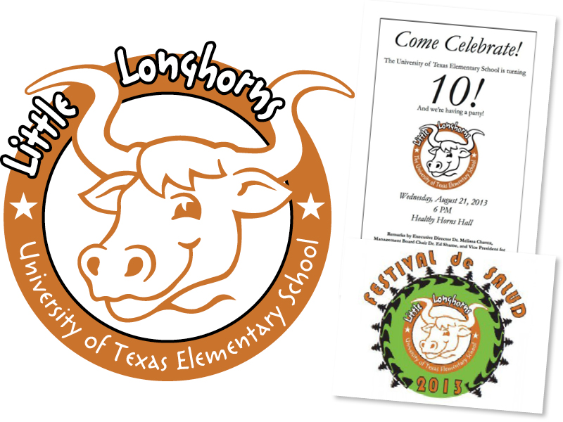
These were the assets I inherited for the University of Texas Elementary School upon beginning my tenure at DDCE. Outdated, novice and visual unappealing, I set forth on updating their visual brand.
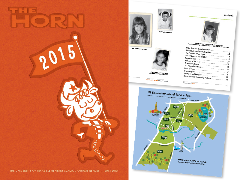
One of the first projects I completed was to create an annual report with a yearbook theme requested by development at UTES. I omitted the word mark and referred to an old UT yearbook for inspiration. Additionally, I provided the unique illustration pictured on the cover and throughout the report.
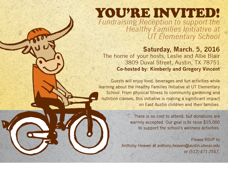
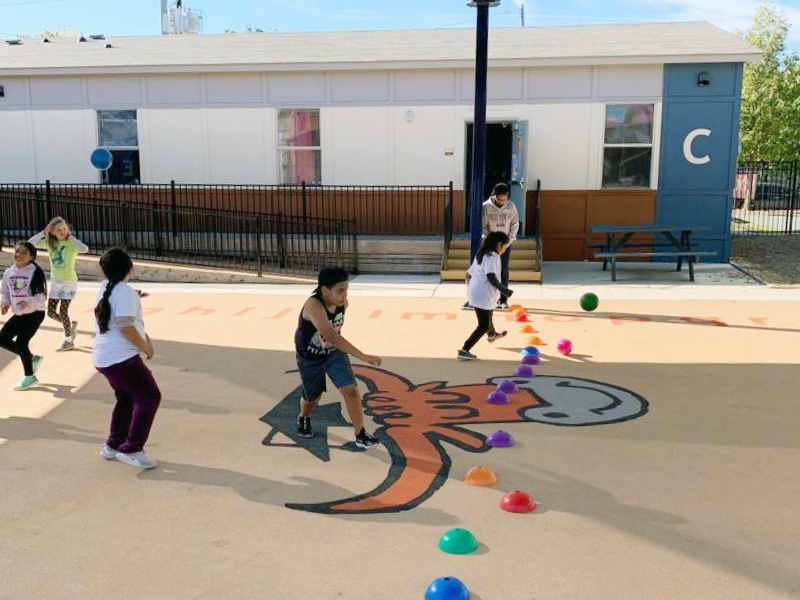
The unique longhorn from the annual report evolved into a simpler character which still maintained its visual appeal, all while targeting UTES fun, youthful audience.
Soon the new character became a familiar image and built a strong visual association with the school. Overtime it was incorporated into everything from flyers, to presentations and promotional items such as T-shirts and tote-bags.
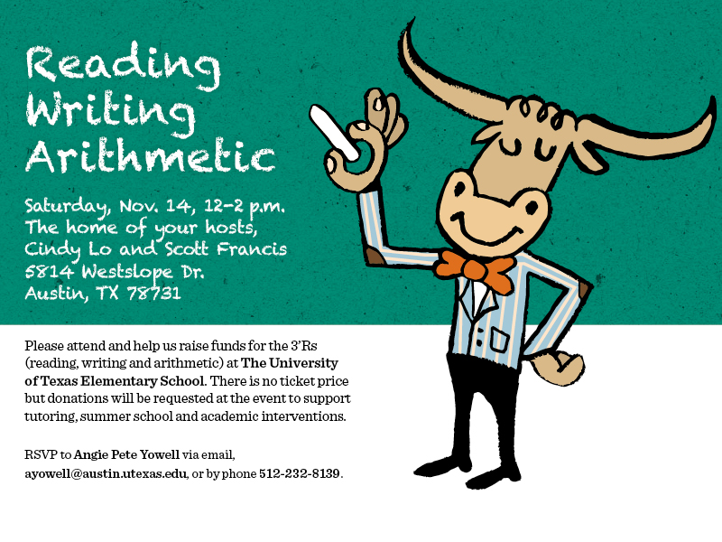
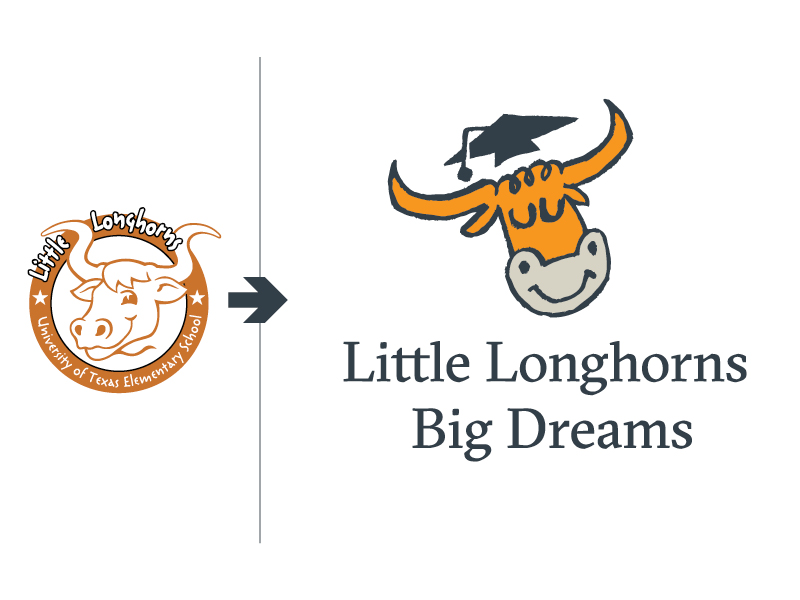
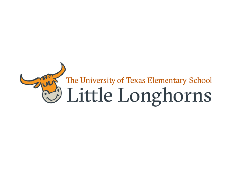
Finally, by 2017 I was tasked with an overhaul of their word mark. It was easy to update the longhorn character to look more childlike and then incorporate that image into a visual identity that matched the university’s brand.
Although UTES carries an official shield word mark from UT Communications and uses that on official reports and other documents, the “spirit logo” works as an alternative for other applications that includes staff polos and other fun promotional opportunities.
Easily the most satisfying aspect of the work I’ve done for UTES on behalf of DDCE, is the kind words of thanks and appreciation from their administration and staff for providing them with a professional visual identity that appeals to the kids at their school.